Baskerville-
Designed in 1757
by John Baskerville, the Baskerville typeface is classified as a middle point
between the traditional typefaces of Caslon and Garamond and the more modern
styles of Bodoni and Didot. “Having been
an early admirer of the beauty of letters, I became insensibly desirous of
contributing to the perfection of them” (Baskerville, Anatomy of a
Typeface), while Baskerville, the man, was illiterate, he did practice
handwriting in the calligraphy form, which he later repeated in his printed
typeface Baskerville is well known for the clean edges, the well-proportioned
balance and the contrast between the thick and thin strokes in each letter.

With his intent to
improve the Caslon typeface, Baskerville increased the differences between the
thick and thin strokes within each letter. He made the serifs sharper and more
elongated and created a more vertical position on the rounded letters. Through
this the rounded letters appear much more circular and because of this each
letter appears more regular and even. With these changes, Baskerville created a
font that had a much better consistency of the size and form of the letters. The
Baskerville font was a much softer and smoother typeface than those that had
come before it. These fonts included Phillipe Grandjean’s Romain du Roi, which was a mathematically created typeface that
felt and looked harsh and cold.

Through much experimentation with printing technology and calligraphy, Baskerville was born. With the creation of his own methods of working and creating, Baskerville created darker inks, which gave his typeface an intense black look and feel. The paper he used, and created, was very bright, which helped to showcase the dark ink Baskerville printed with. It was a one of a kind process, as printers closely guarded the secrets of their craft, and so Baskerville’s typeface was something new, exciting and different.

Baskerville also
recreated the actual printing press, changing the wooden platen with a brass
one, which let the planes meet more evenly. The tympanum used was thick, which
helped absorb pressure and reduce depth, Baskerville instead used a thin
tympanum around the metal and platens. Through these changes, along with the
intensity of his ink and the brightness of his paper, created prints that were
very refined, showcasing the clean lines and beautiful symmetry of the
Baskerville typeface.
Baskerville was
popular in bookwork during the letterpress era and because Baskerville’s
printing technique did not depend on the three dimensional element of
letterpress it has been able to survive into the digital era.

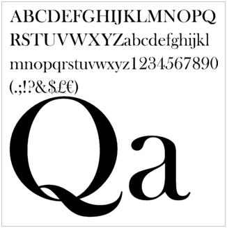
There are many
identifying characteristics seen in the Baskerville typeface, these include
slight calligraphy ‘swishes’, seen in the Q and J, a high crossbar and pointed
apex of the A, a wide arm on the T and a long lower arm on the E, both the
capital and lower case W’s have no middle stroke, the tail on the lowercase g
does not close and the C has both top and bottom serifs.

The Baskerville
typeface is one of symmetry and beauty in its perfection, and in its creation.
With its stark contrast through both the thin and thick weights of line along
with the deep black ink, Baskerville easily stands out on a page, and
highlights the clean edges and well-proportioned lines of the typeface.
References-
1.
Baskerville - http://en.wikipedia.org/wiki/Baskerville
2.
Baskerville; Typophile - http://typophile.com/node/12622
3.
Does Font Matter? - http://www.redlinels.com/2012/08/17/does-font-matter/
5.
Font Designer - John
Baskerville-http://www.linotype.com/702/johnbaskerville.html
6.
John, the Creator of
Baskerville -http://esthertakinola.blogspot.com.au/2012/09/john-creator-of-baskerville.html
7.
Know Your Type: Baskerville
- http://idsgn.org/posts/know-your-type-baskerville/
9.
The Typehead Chronicles -http://www.rightreading.com/typehead/baskerville.htm
No comments:
Post a Comment